General HTML5/CSS3

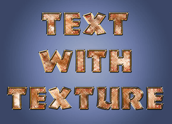
You're probably familiar with using text to mask an image in Photoshop; it's the best known way to add some texture, or even an image background, to your text. You can then use that text as an image on your website; however, wouldn't it be great if you could apply the same effect using just HTML and CSS? The good news is, you can CSS has introduced properties like background-clip and mask-image which you can use to create similar effects to those you're creating in Photoshop. On top of that, you could also use SVG to clip an image with text.
The last technique we're going to look at is texturizing text with mask-image. The basic functionality of this property is that it will clip the area of text that is visible based on opacity.
The next technique we'll look at is SVG clipping. Similar to the CSS method above, SVG also allows you to clip text with images using the clipPath property. Usually the clipPath property contains shape attributes such as a circle or square, but you can also use text.
The first option we'll look at is the background-clip property. This property will define whether the background will be extended into the border or not. It allows the text of a defined element to clip an image.