Published: 2020-09-25

Minimalism is often thought to be boring, but take a look at the great many websites out there that are cluttered with information with menus, advertisements and links cluttering up the page and you have to admit that this doesn't make for an easy viewing experience. Of course, some sites are designed to prevent visitors from doing just that in the hope that they will stay on the site longer, perhaps clicking paid ads whilst doing so. For any small business simply wanting to sell their services though, this is a very bad approach. The viewer just wants to find the relevant information as quickly as possible.
White Space
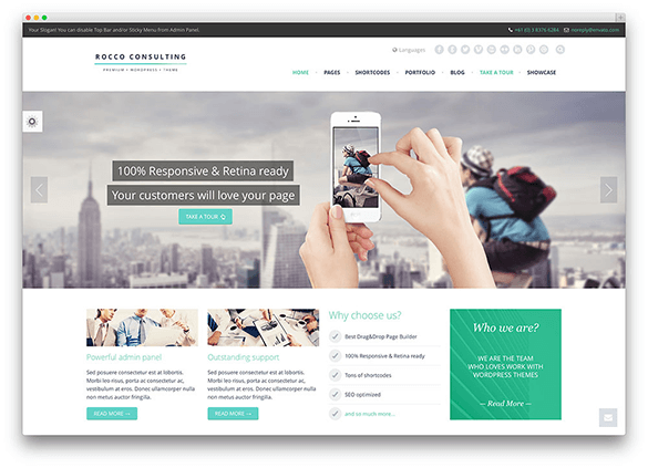
Making sure that your website has plenty of white space allows the visitors eyes to relax and also allows important information to stand out without it having to be in a gaudy-colored font. The use of white space, along with a few well positioned attractive images, can make for some of the most beautiful websites ever.
Professional Looking
It has to be said that a busy site can look unprofessional and confusing for many people. If a visitor is simply looking for a piece of information, they will quickly become annoyed if they can't find it quickly and easily. With viewers spending very little time on each site that they visit, having a cluttered site is an easy way to lose potential customers.
Loading Times
Although most people now are connected to broadband or an alternative fast means of accessing the Internet, there are still people on dial-up connections and even those on broadband appreciate fast-loading times. A minimal and cleanly designed website will certainly load significantly faster than one full of images.
Branding
A clean and minimal website means that your brand will stand out. As the site will be simple, it is important to spend a deal of time focussing on your logo. Having a clean website with a complicated logo is not the greatest idea in the world. Some of the best logos in the world are extremely simple; take Orange or Nike for example. Both of these are logos which are recognizable the world over.
Cost of a Website
The fact is that the more complicated your website is going to be; the more expensive it is likely to be too. This is not always the case however so it is a good idea to ask around. Generally speaking though, a simple website should be sufficient for a small or start-up business and although you may think that you will upgrade it later, you may well find that your customers and potential customers actually prefer the easier to use minimal website that you already have. In summary then, when you are selecting a web designer, don't necessarily look for a minimalist one but look at a number of designer portfolios and see what they do. You will soon get a feel for those who know what they are doing and who don't. Some may even try to dissuade you from a simple site but stand your ground; you know it makes sense.